Not To Die For
Creating a challenger brand that’s to die for
- Brand strategy, design & guidelines
- Bespoke brand illustrations
- Website design & build
Brief
With a name such as ‘Not To Die For’, we had some big boots to fill.
Challenge
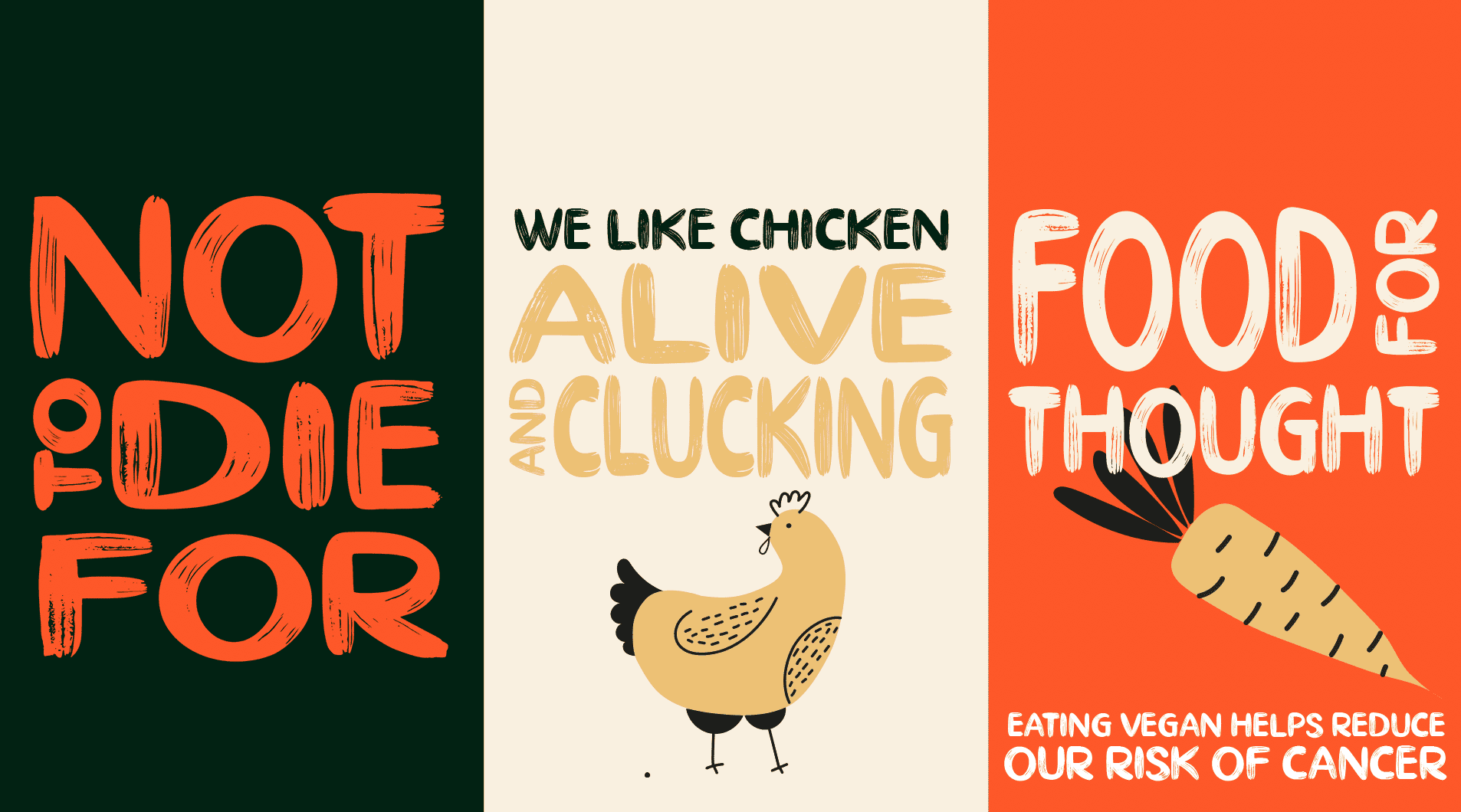
However, recognising that society still stigmatises non-meat eaters, we needed to create a likeable and accessible consumer-facing brand that vegans and vegetarians would be proud to share on their own social platforms. While making it also one that would present itself to meat-eaters in a much more engaging and progressive way.
After all, any group of people willing to go against the grain and live a more ethical way of life, deserve to be backed by a brand that encapsulates the boldness of their revolution.
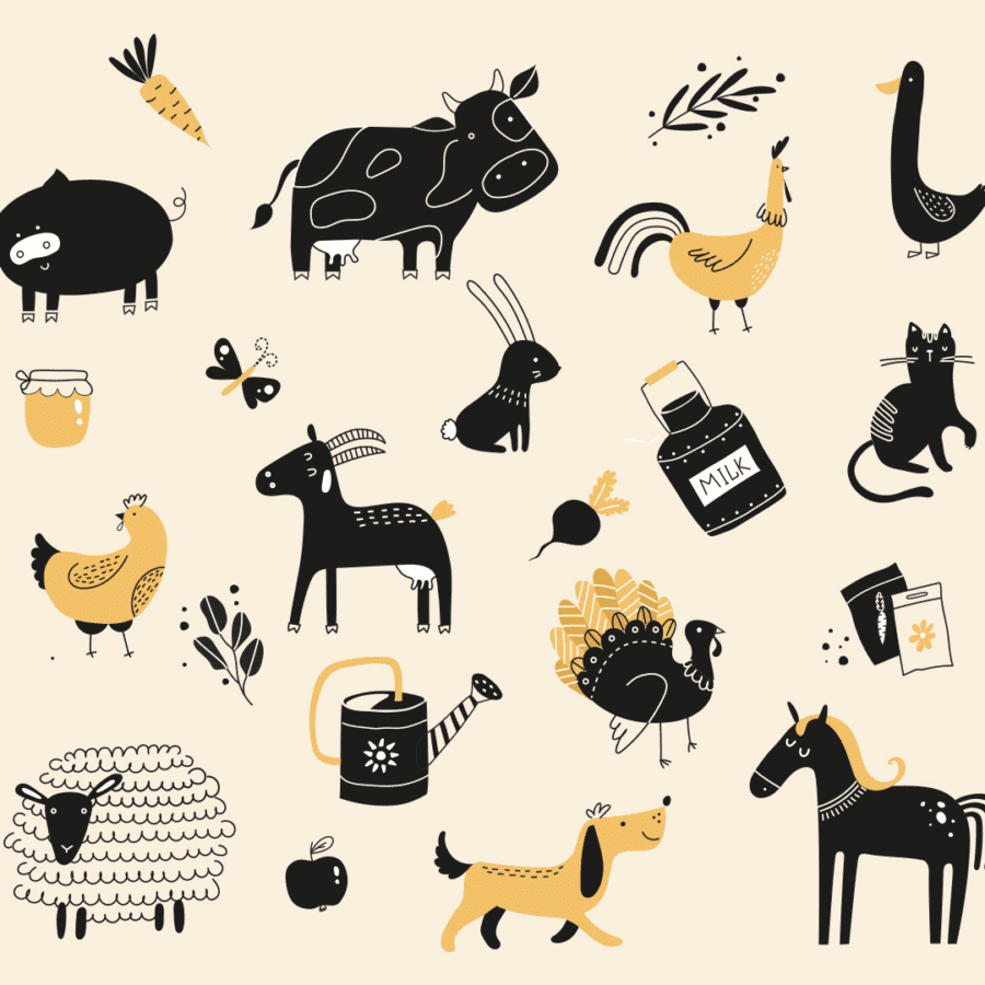
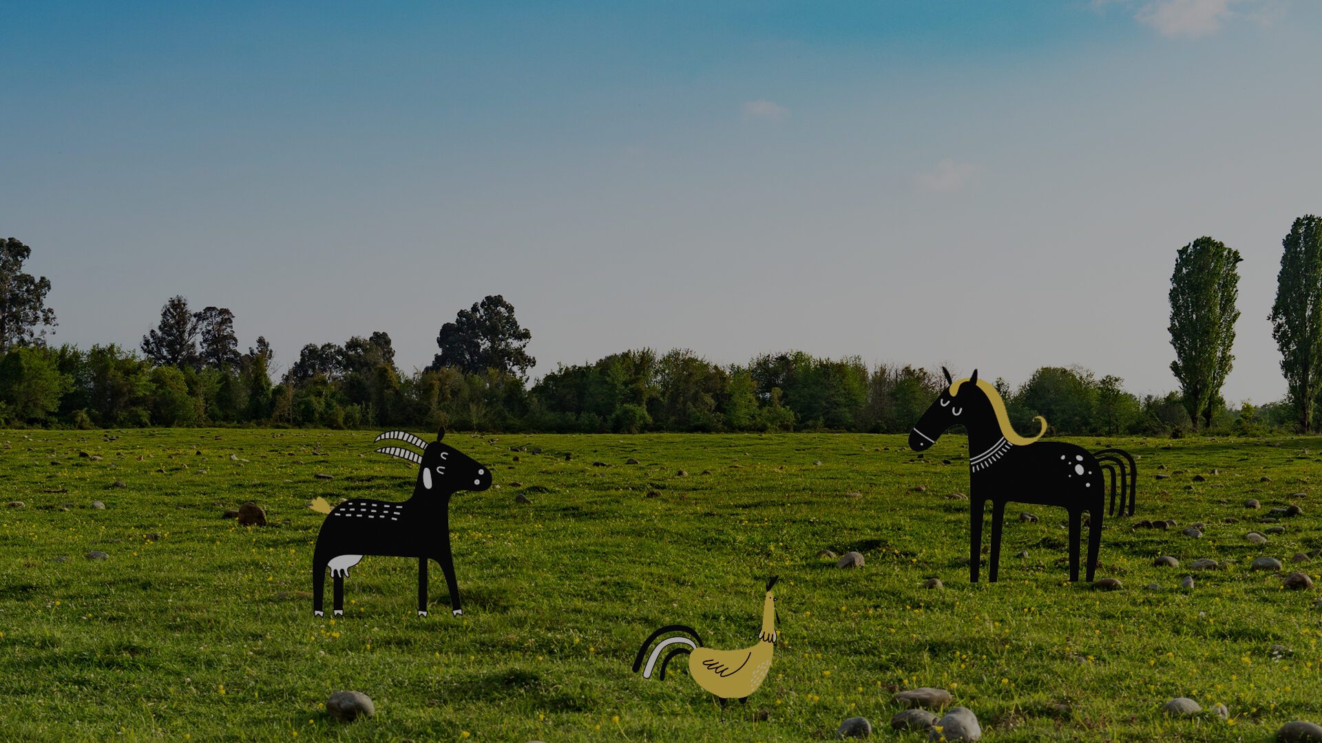
Inspired by the hand-painted animal rights posters of the 60s, our creative team created a new visual and verbal identity that reflected the founder’s and audience’s views.
This meant implementing risqué content for a range of online and offline channels that not only stopped our target market in their tracks but the general public too. While also balancing humour with love and determination.
From actions such as stretching and squashing the font to making hand-drawn illustrations, this is an adaptable and updated brand. The colour palette is contemporary, with hard-to-ignore copy and imagery, enforcing the brand identity to stand proud and cut through the noise.
